

The money you put into paid advertising is useless if you’re sending great traffic to bad landing pages. Someone whose first experience with your business is on a confusing or poorly designed landing page may never return. That means you’re burning cash to get eyeballs on your products, only to exhaust those prospects and have to start from scratch.
The truth is that even some of the world’s biggest businesses have a terrible landing page or two. It’s a common problem, but we can solve it with landing pages that are informed by a deeper understanding of your target audience.
Landing page design consists of the elements, both visual and written, that make up a web page optimized toconvert new customersand encourage repeat purchases. Simplicity in visual layout, benefit-driven copy, andhigh-quality product imagesare three of many guiding pillars for compelling landing page design.
未来,借鉴一些专家来帮助你吧te better landing page designs that nurture prospects into customers.
Table of contents
What is a landing page?
A landing page is a web page with a specific purpose, typically to generate conversions in the form of leads or sales. If you think of yourhomepagelike your physical storefront, the landing pages are like pop-up shops or farmers market stalls. The homepage is aimed at people who already know your brand andwebsite URL. The landing page, on the other hand, is created for a specific goal or audience, typically driven by a marketing campaign or paid traffic.
The purpose of a landing page is to get the visitor to take action—for example, to purchase a product, order free samples, sign up for your email list, download an ebook, or inquire about an information package.
How to build landing pages around your audience’s needs
Though we’re sharing templated recommendations for higher converting landing page design, they’re meant to be a jumping-off point based on your target audience and their unique needs.
Conducting conversion research to get foundational insight is a key part of setting up your landing pages to succeed, according toconversion rate optimization (CRO)consultantMichael Aagaard. Conversion research typically includes things like user testing, analyzing the source of web traffic, copytesting, andsurveys.
“People often forget that the landing page is a part of a bigger user journey,” says Michael. “As a result, they end up burning rubber and wasting time tweaking shiny things that don’t really matter. There are many factors other than the landing page itself that affect the user’s decision-making process—everything from ad source and device over to awareness level and motivation. The better you understand these aspects, the higher your chance of making the right decisions and creating landing pages that really do make more users convert.”
Analyze traffic and device source
Building a landing page based on the device someone shops with is one way to begin your conversion research. Look at your site analytics to see where your traffic comes from and on which kinds of devices.
If most of your customers are coming to your website on a mobile device, you’ll want to optimize your landing pages for agreat mobile experience. Or, if you learn that your shoppers prefer desktop, you’ll be better equipped to build a landing page that enhances the desktop experience.
Nik Sharma, CEO ofSharma Brands, recommends looking even deeper into that traffic to understand what kind of platform people came from—whether it’s TikTok, Facebook, a blog post, etc.
“Not making your pages contextual to the platform they came from will cause your bounce rate to skyrocket and your overall platform ROAS [return on ad spend] to stay low,” he says. This kind of contextual listening drives a better customer experience overall and sets up the best practices below for better success.
Understand when best practices fail
The tips in this article have been successful for the experts who have tested and iterated on them. But be careful to implement these design elements without understanding how they connect to your overall goals. Ben Labay, managing director atSpeero by CXL, warns that “best practices fail when they fall out of context with the business strategy.”
Knowing what yourtarget audiencewants and needs is the basis for building high-converting landing pages.
“The better you understand your target audience, the better landing pages you can build. Don’t get blinded by the latest design trends,” says Michael. “Instead, make sure you get all the basics in place and do in-depth user research so you’re making informed decisions that impact behavior, rather than simply tweaking page layouts.”
Consider the flow of information across the entire landing page
Focus on the flow of information across the entire page rather than solely designing for above and below the fold—essentially everything a user can see on your landing page without scrolling down.
No matter what works best for your customers, you’ll always want to be thoughtful about the kind of copy and content you put at the top of any landing page. But, as Michael says, “Trying to cram a bunch of content into the first screen often backfires and results in a very cluttered experience that overwhelms the user with too much information.”
Instead, he says, “Marketers should think less about ‘over the fold’ and much more about the overall information hierarchy and flow of the content on the landing page.”
Reflect on the following questions as you build your landing pages. The answers will depend on your understanding of your target audience’s overall user journey and the role you’d like the landing page to play.
- Are you answering the right questions and addressing the right barriers?
- Are you managing expectations and following up on “promises” made in the ad source?
- Are you delivering the content in the right order and building momentum toward the conversion goal?
Key elements of effective landing page design
Now let’s break down the core elements that go into landing page design. It’s worth mentioning that not all of the landing page design suggestions listed here will work for your customers. What you choose largely depends on your target audience and their needs. Select the elements that you need to be most successful—you don’t have to use them all!
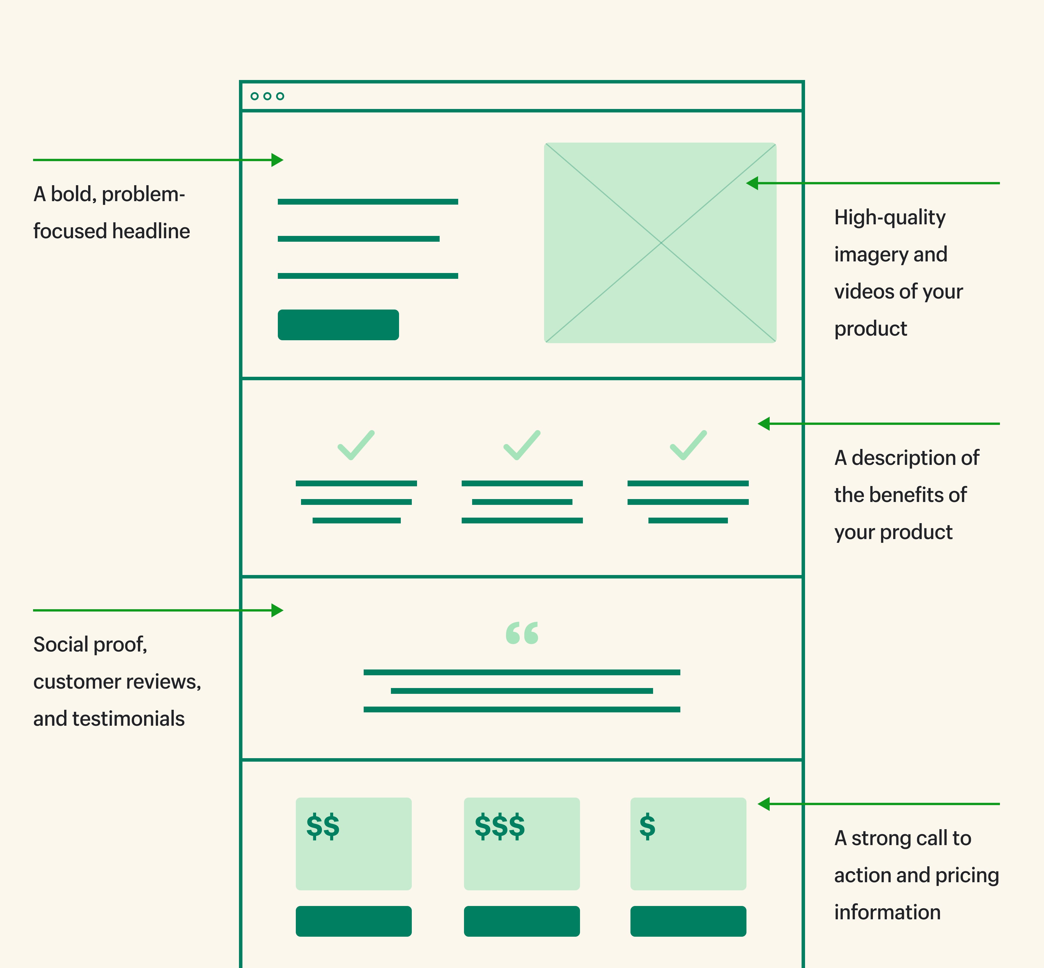
Above the fold content
The fold is the space on a webpage that’s visible without scrolling, and it’s different based on the device someone is using, whether that’s a monitor, tablet, or mobile device, all of which vary in screen size from model to model. Generally, the fold is 600 pixels from the top of a browser window.
Not all of your landing page visitors will scroll past the fold of the page on desktop or mobile. In fact, the majority of site visitors probably won’t scroll down at all.
Landing page copy
Your landing page copy consists of the words on the page—including product descriptions, calls to action copy, headlines, and your meta title and description. Use a bold, problem-focused headline to start off your landing page.
When writing your landing page copy, consider the voice of the customer. Mine reviews and social media, and incorporate the words and phrases your audience uses into your landing page copy.
Remember to tout benefits instead of features. For example, if your landing page is promoting a waterproof phone case, talk about how people can take pictures while swimming when highlighting the IP waterproof rating.
Finally, your landing page copy should be written with yourbrand voicein mind. Consistency is key, even when it comes to targeted promotions and campaigns.
Imagery and colors
Much like your copy should be on brand, so should imagery, fonts, and colors. While you might have more room for creativity with landing page design, it’s still important to provide a synonymous brand experience across all touchpoints.
Your landing page design should account for colors and fonts, as well as have space for well-placed imagery. Many people start with their landing page copy and then develop the visual assets to ensure synergy between the two. Remember, imagery may also include illustrations and videos in addition to product photos.
Customer reviews
One of the smallest, most impactful tweaksEzra Firestone, founder of Smart Marketer and co-founder andCEO of BOOM by Cindy Joseph, made to the buy boxes on his own Shopify store was to addcustomer testimonialsat the top of the box in place of the item name.
Here’s what that looks like:

Including a quote up top builds trust, doesn’t leave people to search for reviews, and lets your own customers speak for you. Just make sure you choose quotes that directly speak to a benefit or pain point each product solves.
Additionally, consider including an entire section devoted to your customer reviews so shoppers can read the perspectives of real people who have actually purchased your products. Make sure to show at least a few of the bad ones and middle range reviews so others can get a complete understanding of what people love and what they don’t.
Call-to-action (CTA)
Every landing page needs a CTA to be effective. Your CTA should drive users to take the action you want them to take. Depending on your landing page, the CTA could say something like “Learn more,” “Buy now,” or “Subscribe.” You might also include pricing information here, if relevant.
If you’re wondering aboutCTAplacement, that depends on what your audience needs, too. You’ll determine this based ontesting that placementto see what drives a better conversion rate. Generally speaking, you’ll want to have a CTA above the fold as well as throughout the landing page, depending on how long the page is.
Landing page design examples
Take a look at some real-world landing page design examples to get inspiration for your own.
Brightland
Brightlandsells extra virgin olive oil from California. It’s gotten positive praise from magazines likeWomen’sHealth, which it uses to its advantage in paid social ads.

Brightland uses a collection page as its landing page. The design is simple, clear, and posts its differentiators right upfront. It also highlights the five-star rating.

Olipop
Olipopsells healthier sodas packed with plant-based ingredients and pre-biotics to support a healthy microbiome. For this Facebook ad example, it drives directly to theproduct page, using that instead of a separate landing page. The design is bright, fun, clean, and simple—all tenants of Olipop’s visual brand identity.

Olipop uses benefit-driven copy to directly handle objections (“But how much sugar does the soda have?”) and position the drink as a craving cure for avid soda drinkers looking for a way to quit.

Other elements that stand out: clear, bold text, in-depth product information (upon scrolling), stars with an actual review count for credibility, a small header that doesn’t dominate the page, intuitive, easy-to-navigate layout, and great product photography.
Path
Path是一个虚拟的照片编辑工作室Shopify website. Its core offerings are product photo editing services. One of the channels it uses to market to and connect with customers is email. Path has a dedicated landing page to drive email newsletter sign-ups.

You can see the page is clearly focused on the goal—driving subscriptions—and doesn’t offer much distraction to get in the way of that goal. The page isn’t readily accessible from the company’s website, but it can drive targeted campaigns promoting newsletter sign-ups to this landing page.
How to create better landing page designs
You’ve caught the attention of a potential customer, and now you have a few seconds to share what makes your brand and your products unique. It’s a pretty big ask to get that across in a few words or images, and even more difficult when a prospect has little context about your brand.
While performance is going to depend on many factors, keeping the overall page design simple can help direct people to the information you most want them to see. If they take nothing else away, what’s the one thing you’d like to resonate?
Here’s how to design better landing pages that convert:
- Optimize your buy box for conversion
- Take great product photos
- Expand on your product descriptions
- Include certifications and unique selling propositions
- Add an upsell/cross-sell section with other product suggestions
- Include a brag bar and a why section
- Test your landing page designs
1. Optimize your buy box for conversion
Ezra calls the buy box the most important part of your product landing pages. It’s a literal box on the page with a highly optimized set of conversion assets that includes a purchase button.
What is a buy box?
The buy box is a small section of each landing page that needs to make a big impact. It’s essentially the conversion engine of your landing page.
Generally, if you’re looking at it on a desktop, the buy box includes an image carousel with photos of the product on the left and your recap, sales copy, pricing, review stars, Buy button or Shop Pay button, and unique selling proposition under the button to the right. Below is one example of a buy box on a desktop.

“Most businesses don’t have sales copy in the buy box, they don’t have social proof in the box, they don’t have unique selling propositions and image format under the Add to Cart button, and the product carousel features images that don’t look good,” Ezra says. “The buy box is everything.”
There are a few templated elements that make space for your copy and images to really shine. A highly optimized buy box includes what Ezra calls “conversionassetstacking.”
Here’s an example of what that could look like on desktop:

2. Take great product photos
The images you include of your products are likely theonlything prospective buyers have when they’re considering purchasing your products, especially if you’re adirect-to-consumer brand. Images are how a buyer pictures an item without being able to hold it for themself. If your photography doesn’t fully capture how amazing your products are, it’s very difficult for customers to do the same.
Optimize product photos for speed and compatibility
Button up the smaller details to ensure a smoother experience. Use an image compressor likeTinyPNGto lower image size for faster loading time. Add in image borders and contextual copy that speaks to the benefits, rather than features, of your products. Use yourwebsite builderto check how image carousels and CTAs render on both desktop and mobile to ensure they’re optimized for both.
3. Expand on your product descriptions
Theproduct descriptionyou might include in your buy box ideally is succinct copy that immediately gets across what your product actuallyis. You have a lot more space farther down the page to provide details that directly handle any objections that might block a customer from completing their purchase.
Eyewear businessPeepersis a pro at this: Above the fold is a plethora of product images, and below you’ll find details and a description that lists all the benefits of going with a Peepers lens.
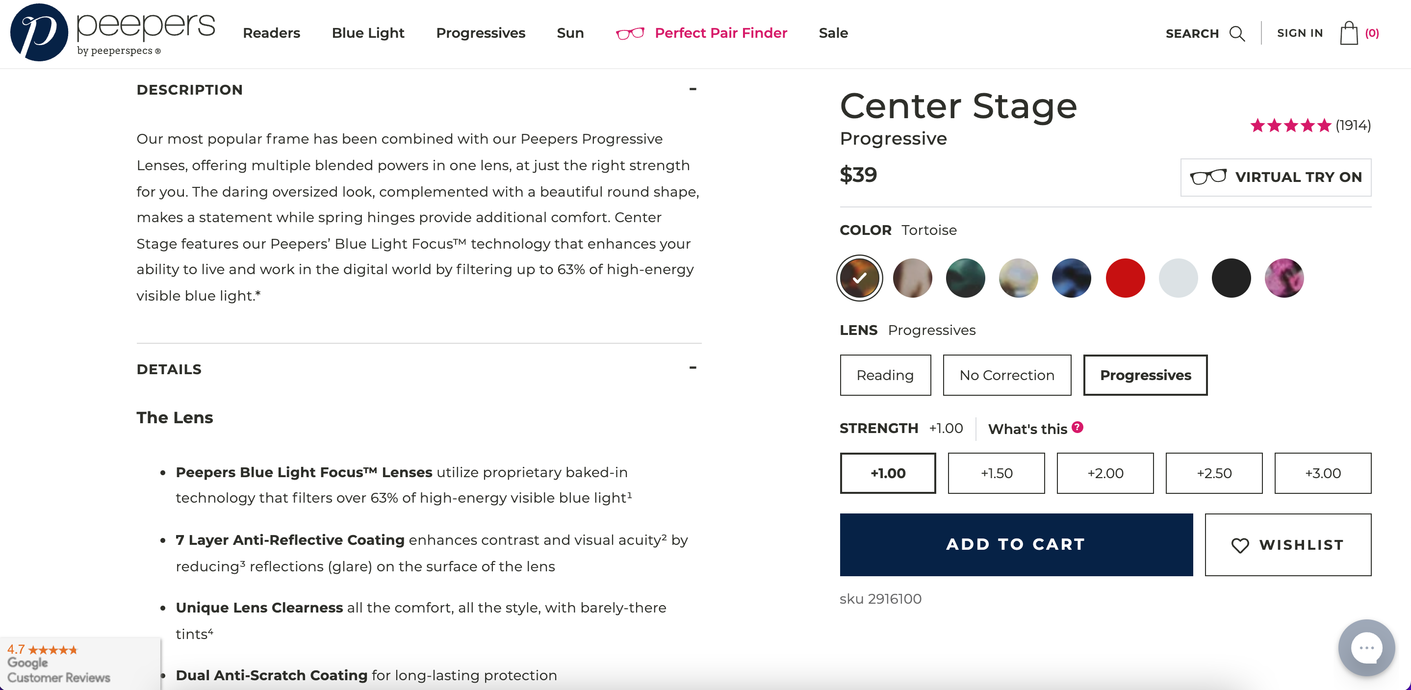
As you develop your product details copy, first write out what your product is and what it does. Then, bullet out the unique benefits, which can speak to the pain points you’re trying to solve or the gap you’re looking to fill in the market. Opting to include everything in the buy box? Consider adding a toggle option, like Brightland does for its olive oils, and further explore product benefits there.

4. Include certifications and unique selling propositions
认证与购物者走很长的路,所以me won’t make a purchase without them. The leaping bunny, non-GMO, or certified B Corp certifications are three examples. If you’ve been certified for anything, put it on your landing page.

You also likely have some stellarunique selling propositions (USPs)for your products. If you haven’t written them yet, spend some time developing what makes your product different from the competition. This exercise takes time, but your USP copy will inform how you position your overall brand in the market and how you structure your landing pages.
5. Add an upsell/cross-sell section with other product suggestions
You have the attention of a shopper, so why notupselladditional products they’ll love? If they see something they like, you’re providing a quick and easy way to add it to the cart. You can add a plug-in to your store to do this. If you’re on Shopify,ReConvert Upsell & Cross Sell,Honeycomb Upsell & Cross Sell, andOne Click Upsell - Zipify OCUare all great apps to check out.
6. Include a brag bar and a why section
Have you ever been featured in a news publication likeForbes,The New York Times, orWired? Featuring those logos on your landing pages with quotes from the articles is what Nik Sharma calls a “brag bar.” Those publications add credibility to your brand, and mentioning them goes a long way with shoppers looking for more information.

Another landing page section Nik has pioneered is the “why” section. Rather than solely weaving in why someone should purchase your product throughout the copy on your landing page,Nik recommends calling it out clearly in its own section. The heading can simply read, “Why [Your Business Name]?” with a paragraph of benefits below it. Or, you can choose a few icons that represent the main differentiators for your brand and write copy to accompany each of them.
7. Test your landing page designs
Once you have your landing pages up and some meaningful traffic coming to your site, you can start to A/B test different parts of your landing page design to ensure it’s converting at the highest possible rate.
It’s not just about finding the best performing tagline, however. Ben notes, “If you test, you don’t want to test to prove opinions, but rather to challenge strategy or test hypotheses directly linked to customer problems or business opportunities.”
Ben says tests should be directly proportionate to factors related to your business’s growth model. If you’d like to acquire more customers, monetize your Instagram, or retain existing customers, the landing page experience and testing hypotheses need to change accordingly.
Build beautiful landing page designs with Shopify
Shopify has all the tools, apps, integrations and themes you need to get started with your landing page designs. Start from scratch or with a template, customize it to fit your unique brand, and manage everything from anywhere. You can also browse thousands of Shopify apps to add landing page features and functionality, helping you boost conversions and make the most of your investment.
Ready to create your business? Start your free trial of Shopify—no credit card required.
Landing page design FAQ
What is landing page design?
How do you create a landing page?
- Choose a platform such as Shopify or Squarespace to create your landing page.
- Design your page with a headline, call to action, and any other necessary elements.
- Use an effective headline. It should be concise and eye-catching.
- Add content to your page such as images, videos, and testimonials.
- Use keywords and other SEO best practices to ensure your landing page is discoverable by search engines.
- Test your landing page and refine it based on the results.