
When working on multiple design projects, it’s easy to become a victim of habit and choose a similar color palette each time. The overwhelming spectrum of available tones, hues, and shades makes it easier to stick with what we know works, rather than experiment with something new and bold.
But color experimentation shouldn’t scare us. Instead, its potential for creative freedom should inspire our daily work and drive innovation.
Color is one of the most powerful design elements on a website.Research showsthat up to 85 percent of consumers believe color is the biggest motivator for choosing a particular product, while 92 percent acknowledge visual appearance as the most persuasive marketing factor overall.
With the potential for such a huge impact, it’s worth taking the time to explore the world of color and carefully select a scheme for each design.
To help you in your search for the perfect color combination, we’ve compiled the ultimate list of top free-to-use online color palette generators. We hope that you’ll find a tool you like, one that will inspire you to move outside your color comfort zone.
Shortcuts ✂️
What is a color palette?
A color palette, or color scheme, is a combination of colors used for a design, piece of art, website, app, or overall brand. Color palettes are chosen with intention, because the visual using the selected colors isn’t meant to use any color outside the ones within the palette.
A color palette can have as little as a single color (with different shades and tints—this is a monochromatic color scheme) or as many as eight colors, as long as they complement each other.
But when we’re talking about brand colors, you typically want to stick to two or three colors to keep your brand visuals simple and recognizable.
Let’s look at an example of how you might present a color palette. A designer pulled the main colors out of the photo below, leaving us with a stunning palette of six colors that work beautifully together.

However, this is a rare instance of a visual existing before the color scheme. What makes choosing brand colors and a color palette for a design, website, or app so difficult is starting from scratch and finding colors that balance each other.
Let’s talk more about how to find a color palette before jumping into our list of color palette generators that will help make the processmucheasier.
How to find a color palette
When you’re trying to find a color palette of just a couple of matching colors, it can feel overwhelming to take a look at the color wheel and the endless options available. Just follow along with our tips here and it will become much easier to find the perfect color palette for your brand or project.
Understand color theory
Color theory refers to the guidelines by which we use color to communicate with an audience. And to start understanding color theory, you first need to know what a color wheel looks like.

The color wheel can be organized into three color groups:
- Primary colors:Red, blue, and yellow
- Secondary colors:橙、绿、紫
- Tertiary colors:Red-violet, blue-violet, yellow-green, blue-green, yellow-orange, and red-orange (although Crayola has given them much more colorful names)
The color wheel is also separated by warm colors (reds, oranges, and yellows) and cool colors (greens, blue, and violets).
But there are even more color properties to be aware of:
- Hue:The pure color on the color wheel
- Shade:The color with black added (making it darker based on how much black is added)
- Tint:The color with white added (making it lighter based on how much white is added)
Now let’s start talking about color palettes. Finding a palette filled with colors that complement each other isn’t all that difficult when you start looking at existing color palettes and color harmonies. A few of these are:
- Monochromatic:Start with a single hue, then add in additional shades and tints of that hue to create a full color palette
- Complementary:A color scheme with two colors from opposite sides of the color wheel
- Analogous:A color scheme with three colors that all sit next to each other on the color wheel
- Triadic:A color scheme with three equidistant colors on the color wheel
- Split complementary:A color scheme with one color from one side of the color wheel and two colors directly opposite from it on the color wheel
- Tetradic:A color scheme with two sets of complementary colors
- Square:A color scheme with four equidistant colors on the color wheel
Having a good grasp of color groups, properties, and harmonies puts you well on your way to creating your own beautiful color palette.
Identify your brand essence
你的“品牌本质”是你的品牌标识,核心values, and company mission. What do you stand for? Therein lies your brand essence.
Why do you need to know this when choosing your brand’s color palette?
Well, we’ve talked about color theory. Now let’s bring in a new element:color psychology. Colors elicit feelings and send certain messages—like how the color blue is said to be calming—so finding a color scheme that encapsulates your brand essence can resonate with your target audience.
Think about it like this:
What colors do healthcare companies often use?Blue.This is because blue symbolizes trust and calmness, two emotions that healthcare companies want to make sure you’re feeling as they help you.
In a similar vein, the colorgreenrepresents eco-friendliness and nature. This is why it’s prevalent in color schemes used by nonprofits or environmentally friendly companies.
Keep these color meanings in mind so you can match your core color to your brand essence:
- Red:Power, courage, excitement
- Orange:Optimism, warmth, playfulness
- Yellow:Friendliness, happiness, energy
- Green:Nature, fresh, peaceful
- Blue:Trustworthiness, confidence, loyalty
- Violet:Luxury, spirituality, healing
- Pink:Modern, love, femininity
- White:Cleanliness, simplicity, clarity
- Black:Elegance, sophistication, prestige
- Gray:Maturity, class, intellect
- Brown:Earthiness, reliability, stability
Pick a core color
Every good color palette starts with a core color. And now that we’ve gone through color theory and color psychology, you’re ready to choose that main color. A signature color canincrease brand recognition by 80 percent, so be strategic when choosing this color representation.
Think of Starbucks green or Tiffany blue.

这些品牌是一眼就能认出来的brand’s core color. You want to strive for that same connection. Which one of the colors and their meanings really fits your brand personality and the message you want to convey? Find a shade of that color that you want to represent your brand.
Create a brand color palette
Once you’ve got your core brand color, it’s time to find a complementary color palette. Think back to the color harmonies we covered earlier: Which color scheme will your core color look best in?
But also consider color psychology. Which color meanings resonate with your brand?
You want to stick to a primary color palette of just two to three colors. However, you can always add secondary colors that are used inmarketing collateraland other designs.
Take a look at HubSpot’s color palette:

While the blue and orange are their main colors, HubSpot has included color codes for six secondary colors that are allowed in branded designs. This helps keep visual content on brand, even when more colors are needed to complete marketing materials.
10 best color palette generators
Ready to pick the proper tool for finding your brand color palette? With these 10 options, you can easily create a color palette that will resonate with your audience. Whether you start from a single color or pull colors from an image, these color palette generators make the process easy.
1. Coolors

TheCoolorsinterface is as simple and intuitive as it gets. You can start the generator to create a new palette or explore trending palettes to gather inspiration for what you might be looking for in your brand.
With Coolors, you can input your chosen base color, or simply hit the spacebar to sift through random color palette options until you find a color you like. Once you’ve found at least one color, click the “lock” icon to save it.
Add or remove the number of colors you want in your palette, lock your preferred colors in place, and keep hitting the spacebar until you’ve found a complete palette that resonates with your design concept. You can save your generated palettes to Coolors for others to use as well.
Best for:Designers or business owners just starting to look for a brand color scheme.
2. Adobe Color

Formerly Kuler,Adobe Coloris an online color palette generator that should probably be bookmarked in your web browser.
This tool is extremely useful for designers who rely on Adobe Creative Cloud for their builds because it gives the option to save color palettes and directly upload them as swatches to CC programs like Photoshop and Illustrator.
Adobe Color also has the ability to apply a color harmony rule, meaning you can easily find a color palette that falls along a color harmony you already had in mind—monochromatic, analogous, complementary, etc.
To find your color palette, select your preferred color harmony or choose “Custom.” Then drag the circles around the color picker until you find a color scheme you’re happy with.
Best for:Designers who use Adobe Creative Cloud and can easily integrate the color scheme into their existing tools.
3. Paletton

Palettonis all about the color palette discovery process. It’s great for designers who are working with a client’s existing brand colors and want to create a full scheme that’s complementary to the business. Plus, Paletton includes a cool feature that quickly generates a mockup illustrating how you can implement the colors on your site.
Paletton also lets you choose between an existing color harmony or a completely custom color scheme. It shows different tints and shades of each color in the palette to help you really home in on the perfect hue.
Best for:Designers looking for a color scheme that complements a brand’s existing colors.
4.Colormind

Colormindis an extremely basic color tool, but in the best way. It has similar functionality to Coolors and is perfect for beginners looking to find the right color scheme for their brand or web design.
You can start from scratch by clicking the “Generate” button and seeing what color schemes pop up, or you can insert the hex code for your core color and click the lock button to get a color scheme that matches your chosen hue.
Each time a color pops up that you want to keep within your palette, click the lock button. Record each of the hex codes so you can refer to your new color scheme and share it with the graphic designers creating your logo or other brand assets.
Best for:New businesses or companies looking to rebrand and are finding a color scheme from scratch.
5. Color Hunt

Color Huntis updated each day with new color palettes created by community members. Each scheme is made up of simple yet elegant tones that can be used for inspiration on any design project.
Browse the “New” or “Popular” tabs to gather inspiration for your color scheme. Or search through the categories related to the brand essence you’re looking for to find a more unique color scheme.
这个调色板工具需要艰苦的工作的choosing your brand colors because you don’t have to generate any color palette. Instead, you get to simply browse available palettes until you find one that sticks out to you.
Best for:Designers looking for inspiration or color schemes that fit into a certain aesthetic.
6. Canva

Canvais a graphic design tool, so it makes sense that they’ve created a free color scheme generator for businesses and designers to use. But this tool is a bit different from the others in our list because it bases color schemes off of an image you’ve uploaded. You can try a demo image, or import an image with a palette you love and watch as the tool displays a similar color scheme to that of the photo.
Easily copy the hex codes by clicking on the color square and save them to reference for your logo or website design.
Best for:Designers who want to pull a color scheme from an existing image.
7. Khroma

Khromahelps designers pinpoint the best color scheme for their projects through the use of artificial intelligence (AI). Their algorithm works to discover your favorite colors and bases a color scheme around those findings.
To get started, the tool asks you to select 50 of your favorite colors. They recommend choosing a variety of hues, values, and saturations to guarantee they get a good idea of what you like. Once you select your top 50 choices, the AI starts training and learning what it can about your preferences. Once it has selected your pairings, you can create gradients, place them into templates to visualize them in real life, and more.
Best for:Designers who consistently struggle with finding great color schemes and want endless options they’ll love.
8. ColorSpace

ColorSpaceis a great tool to use once you’ve pinpointed your base color. All you need to do is paste the hex code into the text field on the homepage and click “Generate” to get started.
Then, the color palette generator will display a lot of different options, all centered around your core color. The user interface keeps everything on the homepage, making it a really easy tool to play around with when trying to find your color palette.
Best for:Designers or business owners who need a color scheme that complements a specific color.
9. Colorkuler

Colorkuleris less about finding your brand’s new color scheme and more about helping you use your existing color scheme to create a homogeneous Instagram feed your followers will love. You can use the tool for free to examine your last nine images, or use Colokuler’s pro version for $2.99/analysis to get an overall look at your entire feed.
This tool then generates a scheme with the dominant colors of your Instagram profile as well as a single color that sums up your overall profile’s color. This is helpful for streamlining your future posts and keeping a consistent look.
It can also be useful if you’re considering a rebrand: Looking at the colors in your most recent photos might help you find a new color palette you’re already using in your marketing, making for an easy transition.
Best for:Designers or marketers looking to create a cohesive Instagram feed.
10. Designspiration
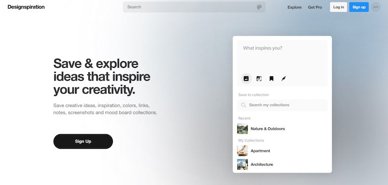
Designspirationis perfect for exactly that—finding inspiration for future designs, be it your brand colors, marketing material design, website or app design, and more.
Each time you land on the Designspiration homepage, their color presets change, giving you an entirely new set of colors and images to explore. You can also search for different themes and categories to find even more photo inspiration for your brand ormood board.
Best for:Designers looking to gather color inspiration for their next design.
Picking the best color palette for your brand
Finding the best color palette for your brand may seem like no easy task, but it doesn’t have to be daunting. With a basic understanding of color theory and color psychology—which you now have, thanks to our mini-masterclass in this article—and the strategic use of a color palette generator, you can easily find a color scheme that perfectly encompasses your brand.
