
Landing page optimization is a critical process of web design. If your client’s ecommerce homepage is like a physical storefront, then the landing page is like a pop-up shop or a stand in the farmers’ market. The homepage is aimed at people who already know the brand and the website URL. The landing page, on the other hand, is created specifically for a marketing campaign or paid traffic.
A landing page has a much different purpose than the home page. The landing page is usually the first contact point for potential customers and gives people an impression and taste of what a store sells, inviting them to explore further. The purpose of a landing page is to get the visitor to take action—for example, to order a sample pack of products, download an ebook, or inquire about a information package.
It actually takesjust 0.05 seconds让游客形成一个意见着陆ge. Therefore, you need to communicate value to the viewer as quickly as possible. If you don’t, you could be losing out on potential customers.
In this article, we’ll go over 10 ways to optimize your client’s landing page for conversion and leave a strong impression of their brand and products.
1. Know your client's users
When you optimize alanding page, design it so that you consider the motivations, desires, and frustrations of your client's customers.
If you're not yet familiar with the term ‘user-centered design’, it means to think like a customer, and tailor all content and services across touchpoints to be in line with what the customer wishes to understand and do.
Understanding the customers allows you to tailor the copy and design in a way that speaks directly to them. When customers understand that the products meet their needs or solve their problems, they are much more likely to convert.
Thus, understanding the customers, or applyinguser-centered design, should be a part of the marketing strategy.
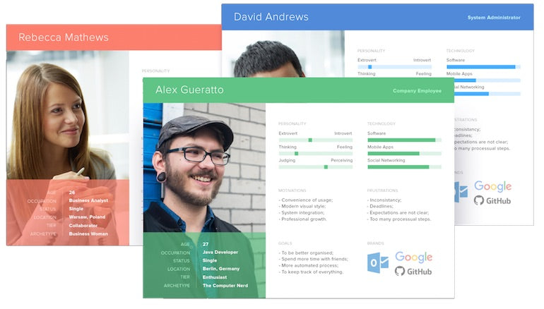
One way to keep your target audience profile in mind during the design process is to create personas. A persona is a snapshot of your idealcustomer profile, with information on their age, language, income, motivation, goals, and problems they're looking to solve.
You might also like:Best Practices for Designing High Converting Landing Pages.
创造现实的角色,最好的方法是talk to real customers, and get to know their pain points and the steps they take to solve a problem. For example, what leads this thirty-year-old entrepreneur to look for a new backpack? What is the keyword they will use to search for the item? What features are they looking for in this product? How does the customer compare similar products, and what factors drive their purchase behavior?
With personas, it becomes much easier to think about what customers want and what to include on the landing page.
Grow your business with the Shopify Partner Program
Whether you offer marketing, customization, or web design and development services, the Shopify Partner Program will set you up for success. Join for free and access revenue share opportunities, tools to grow your business, and a passionate commerce community.
Sign up2. Use a benefit-oriented headline
A big portion of landing page testing is getting the headline right because viewers focus on the headline first when they come to the landing page.
Often, the headline is about the product or a product feature, like ‘dot grid notebooks’ or ‘durable leather goods’. These kinds of feature-oriented headlines do not tell the user what’s in it for them, or the importance of having the product in their lives.
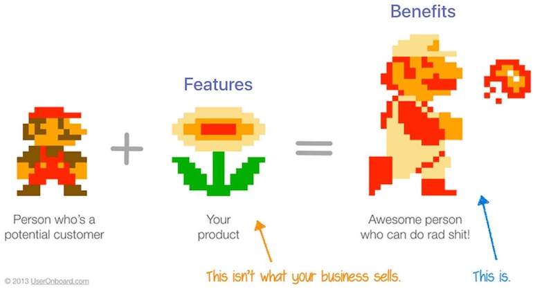
A benefit-oriented headline focuses on the awesome person/home/atmosphere that the user will have or become once they own the product.
Jakub Linowski, a conversion coach, ran a test on an empowering benefit-oriented headline versus a normal headline.
The result?
The benefit-oriented headline increased the conversion rateby 4.3 percent.
So when you are thinking of landing page optimization tactics, focus on the value that’s given to the user. Prospects are much more likely to convert if you talk about what’s in it for them rather than if you just talk about the company and their products.
3. Write clear and relevant content
A landing page is more than a product listing or detail page, and one of the key elements in a landing page is the content.
It should be created to address the following questions:
- Does this site have what I am looking for?
- 是否有足够的information?
- Can I trust this site?
- How long will this take?
- Is there a return policy?
While thinking about the process of landing page testing, keep in mind that one of the best ways to craft effective content is to use the exact words your prospects are searching or saying, in line with their needs and goals.
On the landing page of mymentorship program, I used the exact words the prospects used in the application form, like ‘get clarity in my learning process’. By using the exact words and phrases of what users are looking for, your landing page is going to speak to them very well, and make the users think, “This is exactly what I need!”
"By using the exact words and phrases of what users are looking for, your landing page is going to speak to them very well, and make the users think, 'This is exactly what I need!'"
Because of the clear and relevant copy, the conversion rate for this landing page was 11.5 percent over a period of a one-week, non-paid campaign.
COVID-19 Response for Shopify Partners
Solidarity and community bring us together. Learn how you can stay connected to the Shopify Partner ecosystem, adjust to these complicated times, and help your clients and users along the way.
Read more4. Design with real copy
Lorem Ipsumis well used by designers asplaceholder contentwhen clients aren’t able to supply the real landing page copy. It can seem that this ‘fill in the blank’ approach works, but in reality, actual content almost never fits into placeholders.
If the content doesn’t fit the design, you must either start over with a new design or alter the content to make it fit.
You might also like:10 Successful Marketing Campaigns to Inspire Your Next Project.
Neither is ideal or efficient.
The more effective approach to take in landing page optimization best practices is to adapt content-first design, and make developing content early a top priority.
5. Focus on one main call-to-action (CTA)
As mentioned above, the purpose of landing page testing is to create a page that gets visitors to take action. It’s tempting to include bits and pieces about the products, but this overloads the landing page with too much information.
According to WordStream,48 percent of effective landing pages contain multiple offers, and this is not a best practice. Instead, you want to have one specific offer for each landing page, to keep the prospect focused on one thing at a time.
By using just one call-to-action and removing all elements that are competing for the user’s attention, this laser-focused landing page will convert better.
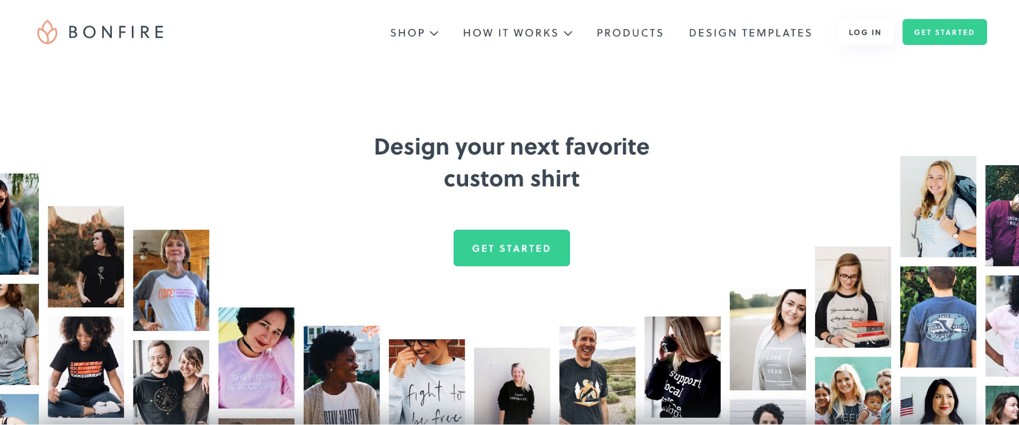
Design tip: the CTA color shouldcontrastwith the rest of the page and color scheme to draw the eyes of the reader to the CTA, as custom apparel companyBonfiredoes on their landing page:
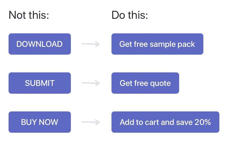
6. Use benefit-oriented CTAs
The CTA is the trigger of the conversion, and so you want to make the offer as appealing as possible when you carry out a landing page optimization audit. For similar reasons as to why you should make the headline about benefits, the CTA text should communicate benefits as well.
You might also like:The Benefits of Adding a Shopify Landing Page to Your Portfolio Site (and How to Make One).
On the internet, we see buttons like ‘click here’ or ‘get access’ everywhere, but these don’t show any context or clues about where the link might go. Users have to do the extra work of guessing what happens after they ‘click here’.
Instead, make CTA buttons and links more descriptive, and include why the user should click the button.
Compare these two CTA buttons: ‘Get Instant Access Now’ and ‘Read Full Essay Now’—which one is more descriptive and clear about what the button actually does?
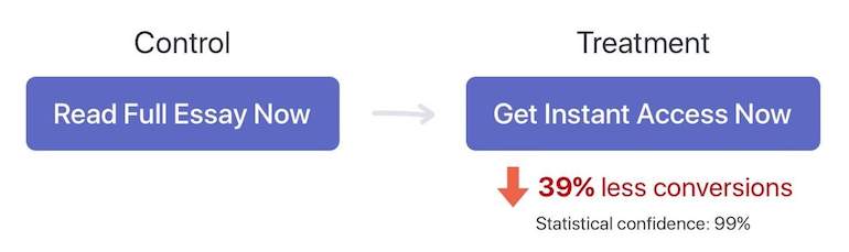
In the control version, the user is clear about accessing the full essay. In the treatment version, the user has to pause and think about what it is that they will gain access to. It’s not surprising that the clear CTA copy increases the conversion rate by a whopping39 percent!
7. Make sure that the design is eye-catchy and easy to look at
Ninety-four percentof the user’s first impression is related to design elements. So the first impression of the landing page has a lot to do with the visual design.
Professional designs that wow users also give an impression of better quality. Therefore, clients should hire a professional designer who can best communicate their brand values and products through designs.
On the contrary,some of the highest bounce factors(that lead users to leave your landing pages) are annoying elements, such as pop-ups, surveys, music, and auto-playing video. Generally, interruptive elements that are initiated without the users’ permission result in a negative reaction and worse user experience. When it comes to landing page testing, don’t be afraid to try different designs and see which one your users like the best.
"When it comes to landing page testing, don’t be afraid to try different designs and see which one your users like the best."
8. Optimize the content length
Landing page marketing content can be short or long. The amount of content you should include depends on what kind of products your client is offering, and should be experimented with during landing page testing.
Here are some general guidelines for determining the length of the page when carrying out landing page optimization:
Short copy performs better when the offer is free, very cheap, or an impulse buy. For these kinds of products, you want to reduce the viewer’s reading and thinking and let them go straight to purchase. Behind this type of purchase, there aren’t a lot of barriers or complex thinking.
Long copy is more suitable for expensive or complex products. When rational thinking and analysis are factors for the purchase, longer copy with explanations, proof, and testimonials creates a more compelling case.
In a nutshell: the more expensive the product, the longer the copy should be.
You might also like:10技术SEO技巧最易康姆merce Website.
9. Use short forms with a minimum number of fields
According toBaymard Institute, a complicated or long checkout process is among the top three reasons for cart abandonment (28 percent). This includes requiring users to fill out long forms.
The more fields you ask the visitor to fill in, the morefrictionit creates, and therefore, the fewer people want to go through the process. Ideally, your checkout forms should only ask for the minimum information needed—where to send the item to, and who is paying for the item.
Marketers usually want more information for marketing purposes, like the customer’s gender, what items they like to shop for, or their birthdays.
But this works against the user experience.
Customers aren’t shopping on the site to give out all their personal details, so that your client can send them an ad on social media.
在你创建一个长表单之前,首先问自己-why is this information necessary? Why do we need this now? Remember, you can always gather more information later on. Always perform this gut check during landing page testing and keep having great UX first in mind, not getting as much information as you can from people visiting the landing page.
"Keep having great UX first in mind, not getting as much information as you can from people visiting the landing page."

10. Create an eye-catching masthead
A moving or animated eye-catching masthead can increase landing page conversion rates up to86 percent. In a highly competitive market, it may be what you need to create a strong impression of your client’s brand and products.
However, the effectiveness may depend on the target audience. For example, video/animation headers are not suitable for antique products being sold to an older demographic.
If you want to consider using animations or videos on the landing page, start by identifying the unique elements of the products or brand that can’t be communicated easily with static text and images.
It does take more time to create an interesting masthead video or animation, but if you do it right, it will help your client’s brand be more memorable and perceived as high quality.
Bonus tip: Decrease page load time
More and more people are using mobile devices to browse the internet, and how fast a page loads can dramatically affect conversion rates.
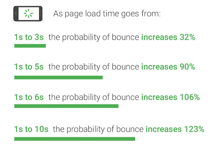
It’s been shown that40 percent of consumers will abandon a page that takes longer than three seconds to load. As the page load time increases from one to ten seconds, the probability of a mobile user leaving a site increases by 123 percent:
The faster a page loads, the less of a chance there is that a user will just get tired of waiting and close the page.
When you are designing a landing page for a client, you should:
- Optimize the size of the images on the page by compressing them using a tool likeKraken
- Make sure that the website is hosted on a reliable and fast server
- Troubleshoot and identify problems using a tool likeWebPageTest
While you may not be able to solve server issues by yourself, you can bring them to the attention of your client. You can then discuss potential solutions such as hiring external contractors to improve their website’s overall performance.
Take the user-first approach to design
As you’re working through your landing page testing and design protocols, it’s important to keep the most important thing in mind—your client’s users, not their company or their products.
The pattern and underlying principle behind these 10 best practices is that it’s all about the user and the user experience. To create high-converting Shopify landing pages, focus on your on-page optimization. Tell the user what’s in it for them and how they will benefit from buying your client’s products. Then, make it really easy to fill out forms and understand where the CTAs link to.
By understanding your client’s users and designing for their needs, the landing page becomes more relevant and memorable. By keeping these tips in mind when it comes to landing page optimization, users are more likely to sign up for your client’s offers, and in turn, your clients will be happier with your services.
What do you do to optimize your landing pages?Share your experience in the comments below!
